
5 Cardinal Sins of Power BI Report UI Design
- everythingpowerbi

- Sep 27, 2023
- 4 min read
Updated: Jan 24, 2025
Building a Power BI report is easy, creating a great one, not so much!
A good UI is a crucial part of the report that often gets overlooked.
I often see reports that have well constructed data models, contain high quality data and useful measures, but lack the UI component needed to make the report great.
A great report delivers a message in a simple concise way that makes it easy for the user understand and comprehend. Frequently I see developers overcomplicating things by
using the incorrect visuals, too many visuals or poorly configured ones.
In section below I will be going through the five cardinal sins of UI design within the Power BI space:
1) Misuse of Pie & Doughnut Charts
Are you surprised that these charts made this list? I hope not.
Pie and doughnut charts are not all bad, they have their place in the Power BI landscape.
Take a look at this chart below:

While this visual looks all colourful and fancy, it should not be used in this situation.
Why you may ask? Let me explain...
Pie charts are useful when you have 2-3 categories you need to display, any more than that and you are asking for trouble.
Humans have difficulty estimating quantity from angles, which is needed in this case.
Longer label names are usually cut off when using pie/doughnut charts, leading to a poor UI experience.
Smaller values that may be of importance are harder to show.
It is very difficult to compare multiple pie/doughnut charts together to determine the greatest value across all charts as an example.
In this case, a bar or column chart will be better suited to display this data.
Remember: If you are going to use a pie or doughnut chart make sure you have at most three categories and that your labels are clearly visible.
2) Poor Chart Titles & Labels
The quality of the chart title and labels can make or break your visual and report.
I have seen some really great thought out visuals, but they lack the correct labels or titles.
Have a look at this visual, does anything stand out?
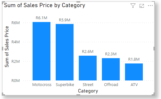
The title Sum of Sales Price by Category and the y-axis label Sum of Sales Price makes it difficult for the user to understand what this visual is about at first glance.
In many reports I have seen developers use the default column/measure names in their charts.
In most cases, default labels usually do not accurately describe what the chart is trying to convey and users may get confused regarding the displayed content.
In the chart below I have amened the title and labels to be more user friendly.

The title Sum of Sales by Category has been renamed to Total Revenue by Category and the y-axis has been renamed from Sum of Sales Price to Revenue.
These changes may seem insignificant, however they play an important role in the overall UI of any report.
3) Blank Card Values
When filters are applied to a report they usually affect the card visuals. This depends on how the interactions, measures and slicers are set up.
Let's say you filter on a specific country with no sales in that region, the card would look like this:

Displaying a blank value is not the best practice as it does not give the user any meaningful information.
Instead of displaying a blank value, rather show something meaningful as shown below.

Displaying a zero makes it easy for the user to understand that there were no sales in that specific region based on the applied filters.
4) Poor Colour Contrast
Getting the colour contrast correct is extremely important as it can make or break the report.
It is vital to make text and UI components readable and accessible to all users, including those with low vision.
A report with a poor colour contrast will ultimately lead to a poor user experience and make it difficult to use the report.
Have a look at the below visual. It is easy to see that the colours chosen for this visual are not compatible with each other.

By making a few small adjustments, we can see that the visual below is much easier to read as the colour combination is fit for purpose.

Here are some examples of good color combinations for UI report design:
Black on white
Dark blue on light gray
Green on yellow
Purple on orange
Purple on light yellow
Red on light green
Complimentary colours go well together with the background colour being lighter than the colour on the foreground.
5) Complexity & Clutter
In the world of Power BI, simplicity is the key to a great user experience.
Many times I have seen reports that try to cram too much information in one visual or one report. This makes it difficult to convey the intended message to the user.
Have a look at the line chart below:
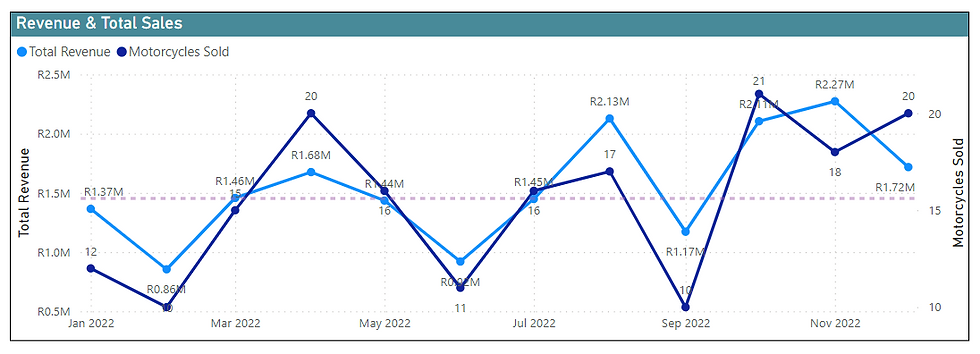
From the get go, we can see that this chart is far too cluttered and has too much going on. Furthermore:
It is difficult to match the data labels to the data points.
The dashed purple median line has no label or value.
Some data points are difficult to make out.
Having multiple y-axes adds confusion to this visual.
One option to improve the above chart is to split the data into two charts as done below:

Splitting the original chart into two separate ones makes it easier for the user to understand. We have also removed the unnecessary data point values and have labeled the median lines.
When building Power BI reports always remember to keep the user in mind. Simplicity is the key to a great report, which will allow users to extract the information they need, make actionable insights and ultimately improve the decision making process.
If you enjoyed this article please like, comment and share this post on your social media platforms.
Happy developing!

This article provides essential insights for data engineers, highlighting the key pitfalls in Power BI UI design and offering practical solutions for clearer, more effective reports.